I goofed around in Adobe Illustrator trying to imitate the Gibson and Epiphone logos but nothing really gelled. I found an automotive-style font called Magneto which seemed a good starting point. I made some minor modifications to the letters and gave the logo a slight arch (slouch - get it?) – close enough!
 |
| The Slouchtone artwork |
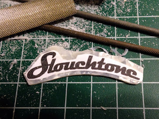
I intended to carve the inlay out of a sheet of 1.5mm white pearloid plastic I had bought off eBay sometime before. After I determined the size of the logo should be about 2.25 inches I sized the artwork in Illustrator and printed it out. I glued the printed logo to the plastic and let it dry.
 |
| The printed logo laminated on to the plastic |
Once dry, I started to carve out the logo. Using side-cutters, a razor saw, an X-acto knife, and several small files I made slow progress. After a couple hours work I had removed enough material to have only the most basic shape of the logo. This was the easy part! I would next need to cut out all those negative spaces inside and between the letters.
 |
| Slow progress timing the plastic |
 |
| Test fitting the logo on the headstock |
 |
| After a lot of carving, only the basic outline of the logo had been achieved |
About this time I sent an image of my progress to my friend Roy. He replied, "why don't you laser-cut it?" Sure, I thought. I'll just give my friend Heinz Doofenshmirtz a call. He can fire up his Guitarlogo-Inator and then I'll be all set. Roy had a slightly better idea. He set me up with his friend Adrian who was not only an actual human, but also had unfettered access to a laser cutter without a chance of being thwarted by a platypus.
A few emails later, I was sending the vector artwork for the logo and the percoid plastic sheet off to Adrian.


